TL;DR Summary:
Two-Row Test: Google is testing a mobile local panel layout that stacks action buttons into two rows instead of the usual single scrollable line.Why It Matters: The change could make key actions like call, directions, and menu easier to spot without scrolling, which may affect customer engagement.Still Unconfirmed: Google has not publicly explained the test or confirmed a rollout, so this appears to be an early experiment rather than a permanent update.Why does your business listing on Google suddenly show two rows of buttons instead of one? Google is testing a new layout for local business panels on mobile search, and it stacks action buttons into two rows instead of a single scrollable line. This matters if you manage a business profile, because the Google Local Panel Two Rows of Buttons test could change how customers find your call, directions, or menu buttons.
What The Google Local Panel Two Rows of Buttons Test Looks Like
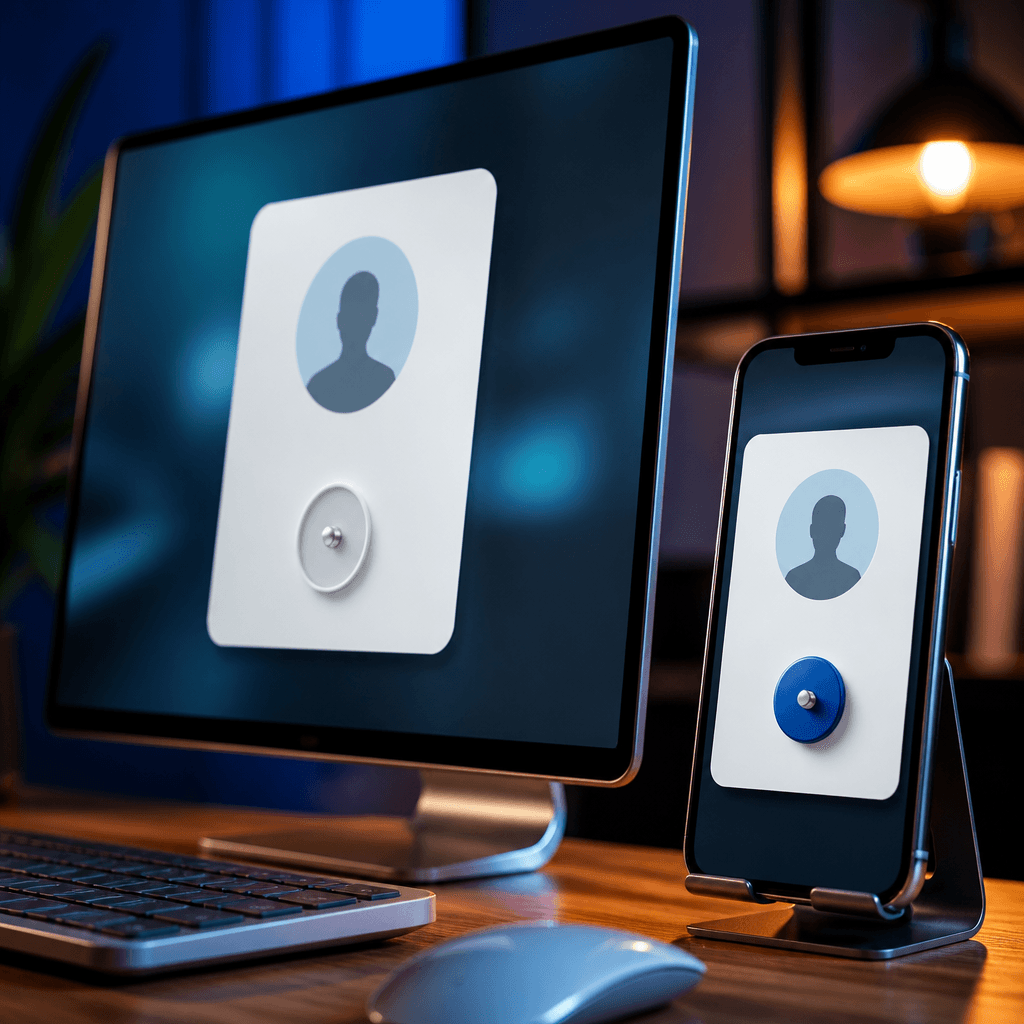
Khushal Bherwani spotted this test and shared a screenshot on X on September 29, 2026. The image shows a local business panel on mobile search with action buttons split across two rows instead of the usual single line. Barry Schwartz compared this to what he currently sees on his own phone, where buttons scroll from left to right in one row. The difference is simple. One version spreads buttons across two lines, the other keeps them in a single scrollable row.
How This Fits Google’s Pattern Of Local Panel Button Tests
This is not the first change Google has tried for these buttons. Back in April, Google tested a “show more” button on local panels, which let people click to reveal additional actions instead of seeing them all at once. After that, Google tested a plus sign icon that also loaded more buttons on demand. The two-row format is the newest variation in this series. Each test tries a different way to display the same set of actions, such as call, directions, website, or menu links.
Why Google Might Be Testing Two Rows Instead Of A Scroll Bar
The standard layout most users see lets you scroll buttons horizontally with your thumb. That works, but it hides buttons that sit further down the row. A two-row layout puts more buttons in view right away, without needing a scroll or a tap on a plus sign. Barry Schwartz noted he assumes the two-row version gets more attention from users simply because it shows more options up front. This is his own assumption, not a confirmed fact from Google.
What Remains Unconfirmed About This Change
Google has not confirmed this test publicly. There is no official statement explaining why the company is trying two rows now, or how many users see this version. It is also unclear how widely Google is running this test, or whether it will become the permanent design for local panels. The only public source right now is the screenshot shared by Khushal Bherwani and the comparison posted by Barry Schwartz on X.
What This Means For Your Business Listing
If you run a Google Business Profile, this test could affect how customers interact with your listing on mobile. A two-row button layout might make it easier for people to spot the call or directions button without scrolling. However, since Google has not confirmed a rollout, you cannot assume this layout will reach your listing yet. Watch your own business profile on mobile to see which version you get. Since unconfirmed layout tests like this one can quietly shift how customers see and engage with your listing, it helps to monitor more than just the panel itself. A site audit tool such as Labrika can flag broader visibility and performance issues tied to your site and local listings, giving you a clearer picture of what might be influencing customer engagement beyond what you can see in a single screenshot.
Keep an eye on your Google Business Profile over the coming weeks to see if the two-row layout appears for you. Check whether button visibility changes affect how customers reach you, such as more calls or direction requests. Since Google has not confirmed a full rollout, treat this as an early test worth watching rather than a permanent change. While you watch for changes to your Google Business Profile layout, tools like Labrika can help you keep tabs on broader site health and visibility issues that might be affecting how customers find and engage with your business.